Subsections
6 Graphical representations
As for any type of data analysis, appropriate graphical representations are of major importance for data understanding. Array-CGH data are typically ratios or log-ratios, that correspond to locations on the array (spots) and to locations on the genome (clones). Therefore in the case of array-CGH data normalization, two complementary types of representations are necessary:
- -
- a dotplot of the array, that takes into account the array design. This is a crucial tool in the case of array-CGH data normalization for two reasons: first it provides an easy way to identify spatial artifacts such as row, column, print-tip group effects, as well as spatial bias and spatial gradients on the array; then it allows a post-normalization control, to ensure that the normalization procedure reached its goals, i.e. significantly reduced the observed effects.
- -
- a plot of the signal values along the genome, which gives a visual impression of the array quality on the edge of biological relevance; comparing the signal shape before and after normalization provides a qualitative idea of the imrpovement in data quality provided by the normalization method.
The arrayPlot method provided by the GLAD package and based on maImage (2) addresses the first point; we add two methods to this toolbox:
- -
- the genome.plot method displays a plot of any signal value (e.g. log-ratios) along the genome;
- -
- the report.plot method successively calls arrayPlot and genome.plot in order to provide a simultaneous vision of the data using the two relevant metrics (array and genome), with approproate color scales.
This method provides a convenient way to plot a given signal along the genome; the signal values can be colored according to their level (which is the default comportment of the function) or to the level of any other variable, in the following way:
- -
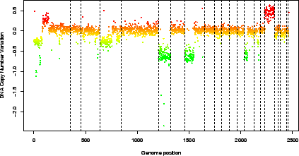
- if the variable is numeric (e.g. signal to noise ratio), the function assumes that it is a quantitative variable and adapts a color palette to its values (figure 3)
Figure 3:
Pan-genomic profile of the array. Colors are proportional to log-ratio values.
|
> data(spatial)
> genome.plot(edge.norm, chrLim = "LimitChr")
 |
- -
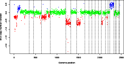
- if the variable is not numeric (e.g. the copy number variation as estimated by GLAD, or a character variable making the disitnction between flagged and un-flagged clones), the function counts the number of modalities of the variable and defines an appropriate color scale using the rainbow function (figure 4).
Figure 4:
Pan-genomic profile of the array. Colors correspond to the values of the variable ``ZoneGNL''.
|
> data(spatial)
> edge.norm$cloneValues$ZoneGNL <- as.factor(edge.norm$cloneValues$ZoneGNL)
> genome.plot(edge.norm, col.var = "ZoneGNL", chrLim = "LimitChr")
 |
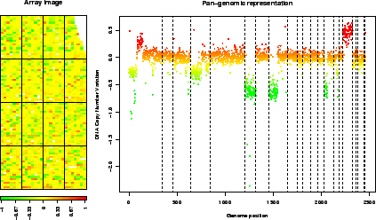
This method successively calls arrayPlot and genome.plot; it checks for color scale consistency between plots, and can automatically set the plot layout (figure 5).
Figure 5:
report.plot: array image and pan-genomic profile after normalization.
|
> data(spatial)
> report.plot(edge.norm, chrLim = "LimitChr", zlim = c(-1, 1))
 |
Pierre Neuvial
2007-03-16